Alterra Capital Partners
Purpose-driven identity design
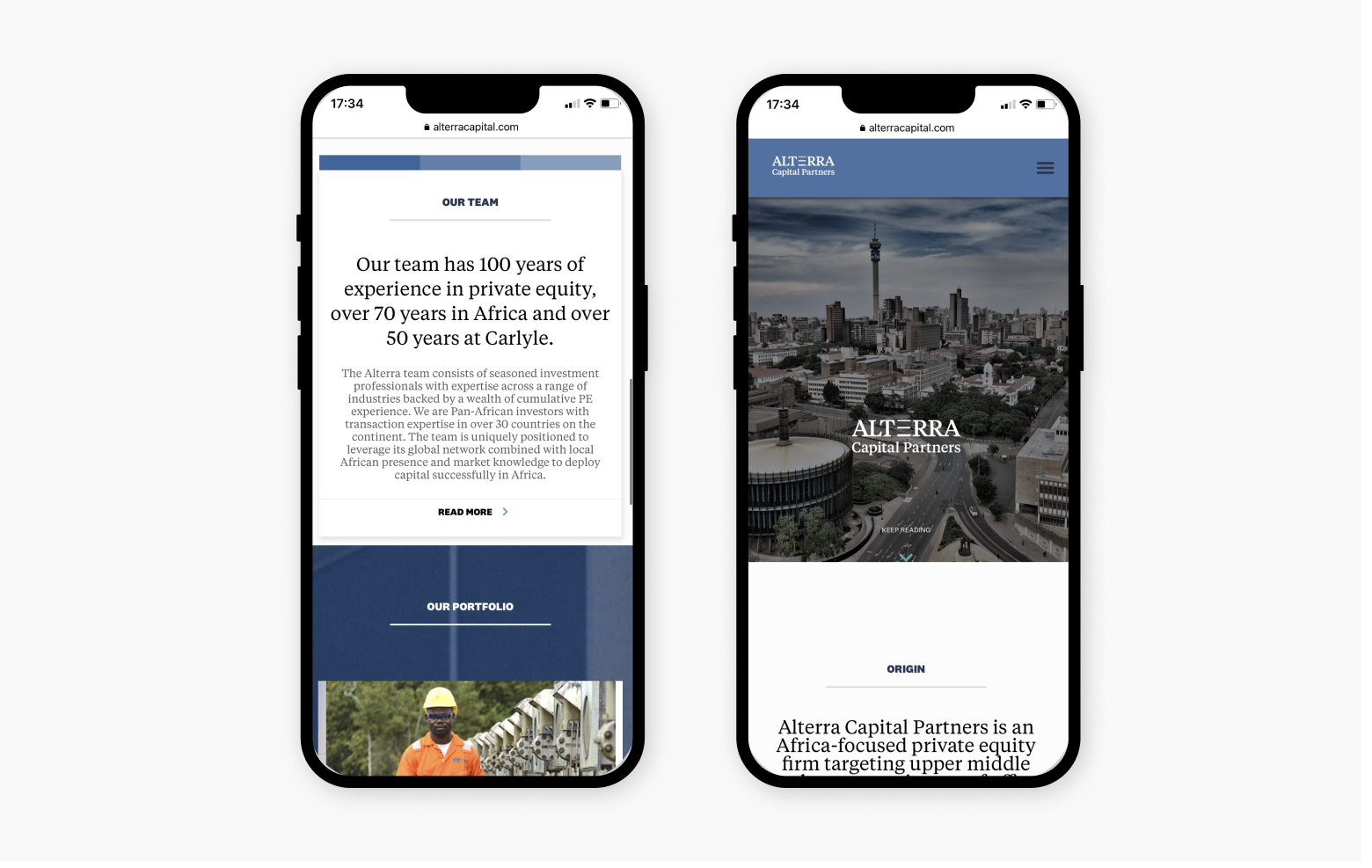
Alterra Capital Partners is an Africa-focused private equity firm formed in 2020. Their investment focus is on companies based across the continent.

The brief
The Carlyle Group is one of the biggest investment funds in the world. Recently, they set out to rebrand their Africa fund as a separate entity, and Breinstorm Brand Architects was tasked with the renaming and rebranding of the firm. This included the brand positioning, logo design, website and other marketing collateral such as business cards, letterheads and templates.

The transformation

A name built on purpose
The name Alterra was chosen for the firm, referring to the next level, higher-ground expertise of the team when it comes to investing in Africa. Alterra is a Latin term, referring to elevation, higher land or an alternative level.

Keeping it fresh
As Alterra is not an entirely unique name, we wanted to give the brand an entirely fresh identity, unlike anything other brands had already done. Thus, we stayed away from obvious symbols of higher ground or elevation, such as interpreting the A as peaks or mountains. Instead, we used the E in Alterra to represent growing wealth and next-level financial thinking in the logo design.

Just the right type
The font Tiempos by KLIM Type Foundry was used to build the logo, lending a contemporary feel while being robust and clear – perfect for economic and legible typesetting.
The showcase of cleverness
Simple yet striking design elements put a fresh, contemporary spin on the financial concepts of elevation and growth.