National Arts Festival Rebrand
A brand that moves to the rhythm of a nation
For the National Arts Festival's 50th anniversary, we created a visual identity rooted in South African cultural patterns — distinctly local yet belonging to no single tradition, designed to flex across sub-brands while positioning the Festival as Umama wezobugcisa: the mother of the arts.

The brief
The National Arts Festival approached us at a pivotal moment. After fifty years as the continent's most significant arts gathering, the Festival needed a brand identity that could honour its heritage while signalling evolution. The brief was deceptively simple: create a visual system for the 50th anniversary that could become the foundation for a lasting brand refresh.
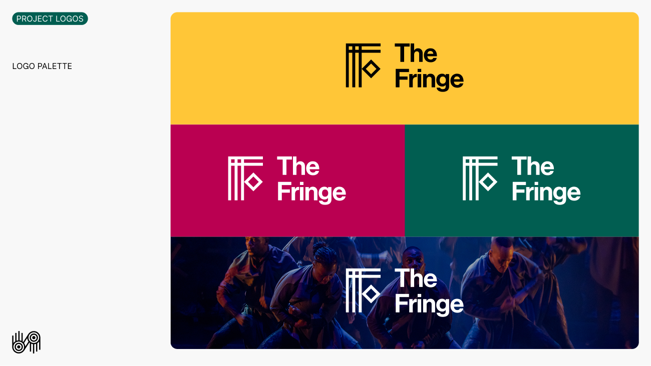
But beneath this lay a complex challenge. The Festival encompasses multiple sub-brands (The Fringe, National Jazz Festival, Eastern Cape Showcase) each requiring distinct recognition while maintaining family cohesion. The identity needed to feel authentically South African without appropriating any specific cultural tradition, speak to diverse audiences from emerging artists to international visitors, and remain flexible enough to expand or contract as programming evolved.
Most critically, after decades of sponsor-led naming, the Festival was reclaiming its own identity. This rebrand wasn't merely cosmetic, it was about asserting institutional independence and cultural ownership.
Pattern as national language, typography as heritage


Cultural synthesis
We developed patterning that draws from South Africa's rich visual heritage without belonging to any single tradition. This deliberate universality promotes national ownership: every South African can see themselves reflected without cultural appropriation.
Modular architecture
The visual system was engineered for flexibility. Sub-brands receive unique pattern combinations while sharing typographic and structural DNA. This creates instant family recognition whilst allowing each programme to develop distinct personality and audience connection.
Feminine foundation
The purpose statement — Umama wezobugcisa, mother of the arts — informed every design decision. Rounded forms and nurturing visual language translate this maternal positioning into shapes, creating emotional resonance beyond mere aesthetics.


